Auto-sized Table Layout with text-overflow: ellipsis
As the title suggests, here is a technique for using text-overflow: ellipsis; with an automatically sized, tabular layout. I needed a 2x2 grid of cells with this kind of functionality and quickly discovered that the trusty text-overflow property does not work with our old friends, the table elements (e.g. <table>, <td> & co.).
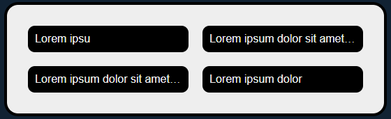
In the usual way of the world in such scenarios I did find a Stack Overflow question addressing this very topic, but since it was related to some pretty old technologies the question itself was old, with many answers coverage a decade of changing web standards. Some of these had received hundreds of votes, but every single one of them was either a) a bridge (hack) too far, or b) required fixed width table cells. I didn't want fixed widths, as I wasn't sure what data would be displayed. What I did know was that I'd have somewhere from 0 to 4 fields, wanted them layed out in a grid, and wanted it to gracefully cut off text that wouldn't fit on a single line (no wrapping). In short, something like this:

Having read over many solutions multiple times I figured there must be a better option. I was lucky in that I didn't need table headers etc. in this scenario, and so I could think a little outside the box, and I knew I could use some more recent CSS developments without having to be concerned about older browsers ("more recent" being already several years old and well supported basically everywhere).
Grid to the Rescue!
CSS grid is a way to layout elements in, as you have probably guessed, a grid. I knew about it, but I thought it only really worked with defined columns. I was vaguely aware that you could specify the sizes of columns in fractions of the available space, and vaguely aware that other things would just size as required; what I didn't know was that you can set every column to use auto for it's size. Once I'd discovered that, it makes the entire affair relatively easy.
Let's say we're working with this markup (assume the content is being merged in via some templating engine or JS):
<div class="table">
	<div class="cell">Some unknown content</div>
	<div class="cell">Some varying unknown content</div>
	<div class="cell">Some longer unknown content</div>
	<div class="cell">Content</div>
All we need to do is ensure the outer element is using display: grid; with the desired column configuration, i.e. here auto auto is used for two automatically-sized columns:
.table {
  /* magic */
  display: grid;
  grid-template-columns: auto auto;
}
Then all that remains is to set a few properties for the inner cell elements:
.cell {
  /* moar magic */
  text-overflow: ellipsis;
  overflow: hidden;
  white-space: nowrap;
}
overflow: hidden; is required to ensure that text-overflow: ellipsis; actually does it's job. The white-space line is to make sure the text doesn't just wrap instead. Sure in many scenarios wrapping text would be better for the user, but circumstances do vary for good reasons. That's all there is to it, I fudged this out on codepen so you can find that below if you wish to see the results in action.
See the Pen Auto-sized tables with text-overflow: ellipsis by Matt Lacey (@mattlacey) on CodePen.